


This is a page intro 2/3
Page intro component is to be used on second level pages and lower. Image is 2:1 ratio (2000x1000px) and has a swirl.


The Hero Banner schema can also contain a video.

Page intro component is to be used on second level pages and lower. Image is 2:1 ratio (2000x1000px) and has a swirl.
Can have green link button or no link. Image should be 2:1 ratio. Schema is "TENA Promo Box".

Page intro component is to be used on second level pages and lower. Image should be 3:1 ratio and have a swirl. Schema is "TPW Page Intro"
The Two Column Text component template does not have a top header, only headers for each paragraph. For a top header ad a Row title component to the page.
Image should be 2:1 ratio. The component template can contain video. Schema is "Double_Rich_Text"

You can add as many paragraphs as you want. Please note that on smartphones the right column content will be shown below the left column content.
Restrictions mandatory fields or not
The Two Column Text component template has some restrictions with mandatory fields. If only one paragraph = no mandatory fields (for example ok to just add a photo). But if adding paragraphs below the first paragraph it becomes mandatory to have a body text in the first paragraph.
Also note there is no alignment of paragraphs between left and right column. Ir you want alignment you need to add new components with only one paragraph per column.
You can have the image either below the text or next to the text.
Note! - If you add a paragraph under the image the body text field in the first paragraph (in this case the one with the image) becomes mandatory so you'll have to have some text over the image.
The image should be 2:1 ratio. Schema is "Double_Rich_Text"

This text spans across two thirds of the page. You can add as many paragraphs as you like. You can place Promo boxes, Simple boxes or Testimonials to the right of the One Column Text using a Column Marker component to create an invisible grid.
Schema is "Single Rich Text"

The image can be either 2:1 ratio or 3:1 ratio and is always displayed below the text field.
The One Column Text component template can display videos.
References are always written like this in a One Column Text component template and placed in the bottom of the page.
1Lorem ipsum dolor sit amet, consectetur adipiscing elit. Donec blandit enim eget facilisis facilisis. Sed in lorem sed nisl luctus.
2Lorem ipsum dolor sit amet, consectetur adipiscing elit. Donec blandit enim eget facilisis facilisis. Sed in lorem sed nisl luctus Lorem ipsum dolor sit amet, consectetur adipiscing elit. Donec blandit enim eget facilisis facilisis. Sed in lorem sed nisl luctus
Foot notes goes here.
References explanations.
1. Lorem Ipsum
2. Lorem Ipsum
Call to action optional. Name and Role are mandatory, Company optional. Image 1:1 ratio, swirl automatic. No image or Company possible for 1/3 box.
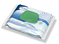
The image should be a png in 1:1
Put the pad on normally. Test results are available 15 minutes after urination.
Follow normal pad changing routines. Remove TENA U-test from pad at pad change.
Read results of TENA U-test. Valid up to 24 hours.
Schema: "Tips_and_questions". Nested into schema "Accordion". Heading and Body text shown.
Image can be used in ratio 1:1.
Dummy text: Your doctor will test your symptoms, examine you thoroughly, and send your urine to be tested in a laboratory for nitrite, leukocytes (white blood cells), and other parameters.
UTIs are caused by bacteria and therefore require treatment with antibiotics. Prescribed antibiotics must be taken throughout the prescribed duration, even if the symptoms disappear early.
As a rule, the symptoms of inflammation subside after 3 to 4 days
Body text goes here
Body text goes here
Body text goes here


